#
Role: UX Research, Interaction Design, Brand Strategy
#
Role: UX Research
Leyenda Legal Group
Leyenda Legal Group
Leyenda Legal Group is a bilingual LA-area immigration law firm serving a Spanish-speaking community that often navigates complex legal situations with limited digital literacy. This project redesigns their website from the ground up. Building trust, surfacing the right information fast, and making it easy for clients to take action.
Leyenda Legal Group is a bilingual LA-area immigration law firm serving a Spanish-speaking community that often navigates complex legal situations with limited digital literacy. This project redesigns their website from the ground up. Building trust, surfacing the right information fast, and making it easy for clients to take action.
(
Overview
)
Problem Statement
Problem Statement
Leyenda Legal Group's existing website failed the very clients it was built to serve — Spanish-speaking immigrants with below-average tech literacy who needed clear guidance, bilingual access, and a trustworthy path to book legal help. Instead, users found a static page with no booking flow, no language toggle, and no reason to stay.
Leyenda Legal Group's existing website failed the very clients it was built to serve — Spanish-speaking immigrants with below-average tech literacy who needed clear guidance, bilingual access, and a trustworthy path to book legal help. Instead, users found a static page with no booking flow, no language toggle, and no reason to stay.
// Client
Leyenda Legal Group — bilingual immigration & criminal defense firm, LA area
// User Pop
Leyenda Legal Group — bilingual immigration & criminal defense firm, LA area
// Platform
Mobile-first website · Desktop companion
// User Pop
Mobile-first website · Desktop companion
// Focus Area
Information architecture · Bilingual UX · Booking & contact flows
// What we aim to change
Core Objectives
Core Objectives
Core Objectives
— Increase consultation bookings by giving users a clear, frictionless path to contact or schedule
— Drive meaningful engagement through bilingual support, trust signals, and prominent CTAs
— Reduce drop-off by redesigning navigation so users can find what they need within seconds of landing
— Build a site that earns trust before a client ever picks up the phone
The original Leyenda site saw minimal interaction beyond users looking up an address. No bookings, no form submissions, no meaningful engagement. Our primary focus was to change that — redesigning the site as an active conversion tool, not just a digital business card.
By building clear pathways to book a consultation, surfacing the firm's credibility up front, and making every page feel approachable to a Spanish-speaking, mobile-first audience, our goal was to turn passive visitors into clients who feel confident enough to take the next step.
The original Leyenda site saw minimal interaction beyond users looking up an address. No bookings, no form submissions, no meaningful engagement. Our primary focus was to change that — redesigning the site as an active conversion tool, not just a digital business card.
By building clear pathways to book a consultation, surfacing the firm's credibility up front, and making every page feel approachable to a Spanish-speaking, mobile-first audience, our goal was to turn passive visitors into clients who feel confident enough to take the next step.
(
Mobile & Desktop
)
(
Mobile & Desktop
)
The Prototypes
The Prototypes

View the Desktop prototype

View the MOBILE prototype
STATISTICS
STATISTICS
// TOTAL SCREENS DESIGNED
25+
Desktop & mobile frames, fully wired
// User Population Changes
5+
Bilingual toggle built into every page, easy CTA access, and mobile-friendly changes
// USABILITY AND STRUCTURE CHANGES
20+
Mapped, structured & navigable
// TOTAL SCREENS DESIGNED
25+
Desktop & mobile frames, fully wired
// USABILITY AND STRUCTURE CHANGES
20+
Mapped, structured & navigable
// User Population Changes
5+
Bilingual toggle built into every page, easy CTA access, and mobile-friendly changes
(
Audiences
)
(
Audiences
)
Who we designed for
Who we designed for
// USER GROUP #01
IMMIGRANT CLIENTs
Spanish-dominant, below-average tech savvy, and anxious about sharing personal information online. Heard about Leyenda through 1020 AM radio. Has never hired a lawyer before.
// USER GROUP #01
IMMIGRANT CLIENTs
Spanish-dominant, below-average tech savvy, and anxious about sharing personal information online. Heard about Leyenda through 1020 AM radio. Has never hired a lawyer before.
// KEY NEEDS
—Bilingual toggle, defaulting to Spanish
—Jargon-free, plain language throughout
—Visible privacy assurance before any form
—Document checklist per service
// KEY NEEDS
—Bilingual toggle, defaulting to Spanish
—Jargon-free, plain language throughout
—Visible privacy assurance before any form
—Document checklist per service
// USER GROUP #02
FAMLY OF IMMIGRANTS
Bilingual second-generation, managing his mother's immigration case on her behalf. Time-sensitive — his family just received a legal notice. Wants credibility fast.
// USER GROUP #02
FAMLY OF IMMIGRANTS
Bilingual second-generation, managing his mother's immigration case on her behalf. Time-sensitive — his family just received a legal notice. Wants credibility fast.
// KEY NEEDS
—Practice areas clearly listed up front
—Founder credentials visible immediately
—Fast booking with transparent pricing
—Phone as a fallback contact option
// KEY NEEDS
—Practice areas clearly listed up front
—Founder credentials visible immediately
—Fast booking with transparent pricing
—Phone as a fallback contact option
// USER GROUP #03
NON-IMMIGRANT CLIENTS
English-dominant, referred by a friend after a car accident. Not interested in immigration — needs to quickly confirm the firm handles personal injury before he bounces.
// USER GROUP #03
NON-IMMIGRANT CLIENTS
English-dominant, referred by a friend after a car accident. Not interested in immigration — needs to quickly confirm the firm handles personal injury before he bounces.
// KEY NEEDS
—Non-immigration services featured visibly
—Strong trust signals and testimonials
—Professional design that signals competence
—Consultation booking within one click
// KEY NEEDS
—Non-immigration services featured visibly
—Strong trust signals and testimonials
—Professional design that signals competence
—Consultation booking within one click
(
Design Challenges
)
(
Design Challenges
)
What we had to solve
What we had to solve

// Before
VISUAL hierarchy
All elements felt equal in weight. No CTA above the fold. The hero image of a courthouse made the firm feel focused on criminal law not immigration, its core practice. Users had no path to follow.

// AFTER
Clear hierarchy, human face, guided path
Redesigned the hero with the attorney's photo and mission statement to build immediate trust. Moved "Work with Us" and "View All Areas" CTAs above the fold to give every user a next step on arrival.
// Before
busy nav leading to external sites
3 of 7 menu items were resource links (EOIR, USCIS, Privacy Policy) that opened external government websites with no context. Users were confused and lost without warning.

// AFTER
Resources grouped, context added
Condensed EOIR, USCIS, and Privacy Policy under a single "Resources" dropdown. Built internal landing pages explaining what each external site is and what users can do there — before linking out.
// Before
12 practice areas, one endless scroll
The original Practice Areas page was a monotonous, text-heavy list. Users who knew what they wanted had to scroll past everything. Users who were exploring had no visual anchors to stop on.
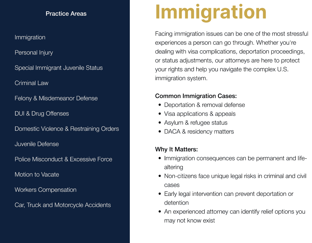
// AFTER
Scannable index + visual info cards
An interactive list lets users jump directly to a specific area. Scrollable visual cards with images and descriptions serve users who want to explore. Both modes supported on the same page — no compromise.
Lessons Learned
What we had to solve
(
Design Challenges
)
// FINAL TAKEAWAY
This project was the first time building something for a real client with real stakes. The biggest shift wasn't in the design itself — it was learning that a good design process means listening more than designing. Jesse's context (who his clients are, where they come from, what they're afraid of when they walk in) shaped almost every decision made about hierarchy, language, and tone. A website is only as trustworthy as the understanding behind it.
Team: Nosheen Ullah, Jalen Marcelino, An Truong, Raul Valadez
Course: COGS 187B — Interaction Design Studio, UCSD
Client: Jesse Gastelum, Leyenda Legal Group
Lessons Learned
// FINAL TAKEAWAY
This project was the first time building something for a real client with real stakes. The biggest shift wasn't in the design itself — it was learning that a good design process means listening more than designing. Jesse's context (who his clients are, where they come from, what they're afraid of when they walk in) shaped almost every decision made about hierarchy, language, and tone. A website is only as trustworthy as the understanding behind it.
Team: Nosheen Ullah, Jalen Marcelino, An Truong, Raul Valadez
Course: COGS 187B — Interaction Design Studio, UCSD
Client: Jesse Gastelum, Leyenda Legal Group