(
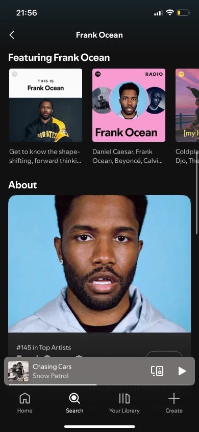
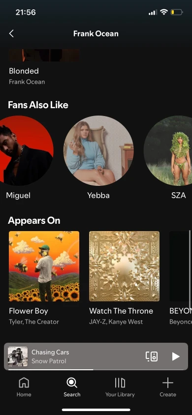
What the artist page actually looks like — and where it breaks
)


(
Four changes, each grounded in research
)


Four new participants — none of whom had seen the prototypes before — completed the same tasks on three versions: the original Spotify design, Redesign A, and Redesign B. Because the prototypes weren't fully functional, we adjusted tasks from "add songs to a playlist" to "find and identify specific songs," which let us test navigation and discoverability directly.
(
Redesign Results
)
// Faster task completion
Participants located songs significantly faster in both redesigns. The tab structure eliminated the aimless scrolling that slowed users in the original.
// "Appears On" found
In Round 1, one participant never found it at all. In Round 2, all participants located featured tracks quickly. Participants described it as feeling like a "new feature" — even though it existed in the original.
// Reduced cognitive load
Participants spent less time orienting themselves and made more confident navigation decisions. Even during the brief tab-exploration phase, orientation time was shorter than in the original.
// Unanimous preferences
All four participants chose the redesigned version when asked which they'd prefer Spotify to use. Descriptions: "cleaner," "more organized," "finally makes sense."
LESSON LEARNED
// Visibility is usability
01
The "Appears On" tab felt like a brand new feature to Round 2 participants — even though it existed all along. This was the clearest possible evidence that a hidden feature and a missing feature are functionally identical. Placement and labeling determine whether something gets used.
// Success is measured in reduced effort, not new visuals
02
Participants praised fewer taps, clearer pathways, and less scrolling — not aesthetics. The redesign didn't change how Spotify looks so much as how it thinks. The satisfaction came from the app finally supporting how users naturally browse and search.
// Familiarity can mask usability problems
04
Most of our Round 1 participants were experienced Spotify users. They completed tasks the original design was making hard — not because the design was good, but because they had learned to work around it. This reminded us to actively seek moments where users succeed for the wrong reasons.